
A mother too weak to pose hands her son his tubes of paint until the moon rises in the studio window. A widow in Delft settles the family's bill at the baker's with two of her late husband's canvases. And in Berlin, a paint maker trying for a red produces the blue that will later fill the rivers of Japanese prints.
Cool Stories About Art is a newsletter to learn art the fun way.
Join 200,000+ readers and get:
10 new art stories / month
The entire archive of content (1,000+ articles)
Comment, ask questions, and chat with other readers
Blue paint, like any paint, is a colored powder ground fine and bound in oil, egg or water. For centuries the finest blue powder was also the rarest. Natural ultramarine was made from lapis lazuli, a stone mined in a single region of today's Afghanistan, and it cost more than gold. Painters who could not afford it turned to azurite, a cheaper copper mineral with a greener cast, or to indigo, a plant dye that looked dull on paper.
Chemistry then changed the supply. Prussian blue appeared in Berlin around 1706, cobalt blue in France in 1802, and a factory version of ultramarine followed. Each new blue brought the color within reach of more painters and printers.
Painters wanted it so badly because of what blue does to space. It is the color of the sky and of faraway hills, and a blue surface seems to sink back from the eye while yellow comes forward. Blue became the natural color of distance, of night and of shadow, and artists and writers gave it meanings of their own, from royal power to spiritual longing.
Each work here earned its place in one of two ways. Either it marks a turn in the story of blue, in its price, its supply, its chemistry or what it was said to mean, or most people recognize it on sight. The countdown runs by date, from the most recent at number 12 to the oldest at number 1, so the list walks the history of the pigment backward, from blue sold by the million to blue weighed against gold.
12. Maxfield Parrish, Daybreak (1922)
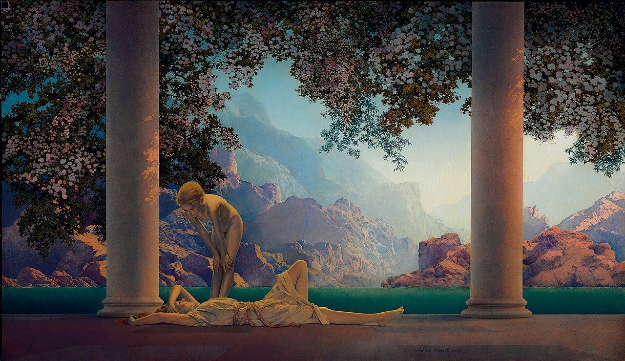
Behind the two girls of Daybreak, a pale blue sky fills the whole back of the picture, above a valley of rocky mountains framed by two tall columns. On the stone terrace in front, one girl in a thin gown lies stretched out with an arm behind her head, while the other, nude, bends over her. Maxfield Parrish, then one of the highest paid illustrators in America, finished the picture in 1922 in his studio at Plainfield, New Hampshire. That sky is so closely tied to him that its blue carries his name, Parrish blue.
The name came from the way the picture was sold. In August 1920, the House of Art, a New York publisher of art prints, commissioned Daybreak, the first work Parrish made solely to be reproduced in color. Once the print went on sale, his sky hung in ordinary American homes. By 1925, according to the National Museum of American Illustration in Newport, Rhode Island, there was one Parrish print, all his prints counted together, for every four American households.
To make that blue glow on paper, Parrish first had to make it glow on the board. He started from a white ground and laid each color on its own as a thin transparent glaze, which had to dry and be sealed under varnish before the next went on. Light passes through the layers and bounces back off the white underneath, much like colored cellophane laid over white paper.
For the same reason, he refused to mix his colors on the palette. Mixing, he said, gives "a color you look on instead of into." For his skies he relied on cobalt blue, developed in 1802 by the French chemist Louis Jacques Thénard, which painters had taken up in place of the far costlier ultramarine. As early as 1818, the English watercolorist John Varley judged cobalt "superior when used in skies."
In Daybreak, those glazes also do the work of distance. The rocks nearest the terrace glow orange and pink, the mountains behind them turn mauve, and the farthest ridges fade to a blue barely darker than the sky itself. Painters call this aerial perspective: the more air lies between the eye and a mountain, the bluer and paler it looks.
At a Glance
Artist: Maxfield Parrish (1870 to 1966)
Painted: 1922
Medium: Oil on board
Size: 67.3 × 114 cm (26.5 × 45 in)
Where to see it: Private collection, not on public display
11. Franz Marc, The Large Blue Horses (1911)
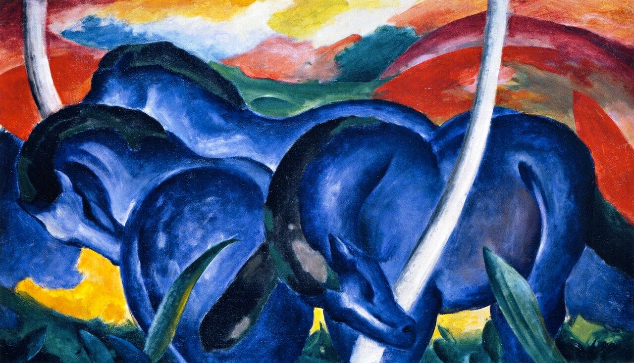
Three horses with blue bodies stand pressed together, heads lowered, so close that it is hard to tell where one animal ends and the next begins. Behind them, red and violet hills roll toward a sky streaked with yellow. Franz Marc painted The Large Blue Horses in 1911 in Sindelsdorf, a Bavarian village south of Munich, the year he and Wassily Kandinsky founded the Blue Rider, a circle of Munich artists. Horses are not blue, of course. Marc's blue came from a color system he had spelled out in a letter at the end of 1910.