Color in Art: 12 Paintings and How They Work

Color in art is pigment doing three jobs at once: describing an object, setting a mood, and steering your eye around the picture. Painters pick it for effect more often than for accuracy. Here are twelve paintings and the exact color decision behind each one.

Color in 30 seconds

  • Hue is the color itself, value is how light or dark it is, and saturation is how pure it is. Change one and the picture changes.

  • Complementary pairs, red with green, blue with orange, yellow with violet, sharpen each other when they sit side by side. That is contrast in its color form.

  • Colors from the same family calm each other down instead. That is harmony.

  • Pigments carry histories and price tags. Ultramarine cost more than gold for four centuries, green pigments were often poisonous, and orange had no name of its own in English until the fruit arrived.

  • Take hue out of the equation and you get a monochrome, which is a tradition of its own.

  • Some pigments break their promises. Yellows darken, greens and lakes fade, and several famous paintings are now the wrong color.

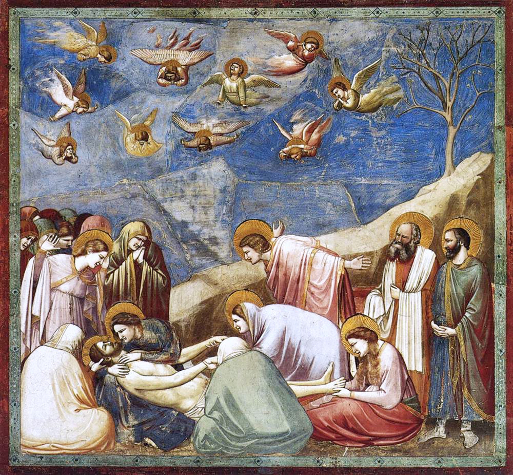
Giotto, Lamentation (c. 1305)

Giotto fresco of the Lamentation with mourners under a deep blue sky
Giotto, Lamentation (c. 1305), Scrovegni Chapel, Padua.

That blue sky was a technical problem. The blues available to Giotto, ultramarine and azurite, cannot survive in wet lime plaster, so they could not go on with the rest of the fresco.

Giotto had them applied afterward, on dry plaster, with a binder that sits on the surface rather than bonding into it. That layer always fails first, which is why so many medieval skies have gone patchy.

Jan van Eyck, The Arnolfini Portrait (1434)
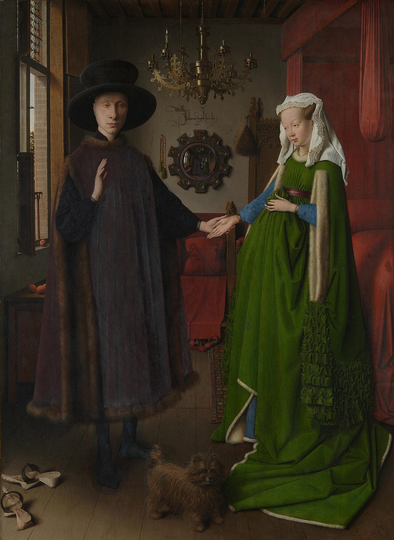
Van Eyck double portrait of a man and a woman in a green gown in a Bruges interior
Jan van Eyck, The Arnolfini Portrait (1434), National Gallery, London.

Oil paint existed before van Eyck. What he worked out was its transparency.

The green gown is a copper green laid down in thin translucent layers. Light travels through them, reaches the pale ground underneath, and comes back to your eye already colored. That is why it reads as lit from inside.

Michelangelo, The Libyan Sibyl (c. 1511)

Michelangelo fresco of the Libyan Sibyl in orange and green drapery on the Sistine ceiling
Michelangelo, The Libyan Sibyl (c. 1511), Sistine Chapel, Vatican.

Watch the drapery. Where an orange fold turns toward the light, it turns green. The technique has a name, cangiante, and painters reached for it when a color had nowhere left to go without going chalky.

Nobody saw those colors properly for centuries. The cleaning that ran from 1980 to 1994 lifted off soot and old glue varnish, and Michelangelo came back paler and sharper than the art world expected. Several critics insisted the restorers had scrubbed away his shadows.

Titian, Bacchus and Ariadne (c. 1523)

Titian painting of Bacchus leaping from a chariot under a deep ultramarine sky
Titian, Bacchus and Ariadne (c. 1523), National Gallery, London.

Titian red is a method. He glazed a transparent red lake over solid vermilion, so the color keeps its body underneath and gains depth on top.

The sky is natural ultramarine, spread across the upper half of a canvas nearly two meters wide. It was painted for Alfonso d’Este, Duke of Ferrara, whose court could afford a sky that size in the most expensive pigment on the market. He had painted Sacred and Profane Love about a decade earlier.


New here? Join 130,000 readers who get one great art story in their inbox, free.


Vermeer, Girl with a Pearl Earring (c. 1665)

Vermeer painting of a girl in a blue and yellow turban against a dark background
Johannes Vermeer, Girl with a Pearl Earring (c. 1665), Mauritshuis, The Hague.

The turban is natural ultramarine, ground from lapis lazuli, and Vermeer spent it on a small painting of a girl nobody has ever identified.

The background has changed since he left it. A technical study at the Mauritshuis published in 2018 found a green curtain there, painted with indigo and a yellow lake over black. The organic colors faded, the folds went with them, and what is left reads as flat dark space.

Delacroix, Women of Algiers in their Apartment (1834)

Delacroix painting of women seated in an interior in Algiers among red and gold textiles
Eugène Delacroix, Women of Algiers in their Apartment (1834), Louvre, Paris.

Delacroix spent six months in Morocco and Algeria in 1832 and came home with notebooks full of watercolors and written color notes. He painted this in Paris two years later, from those pages.

The shadows are where the work is. Rather than darkening them with black, he built them from small touches of color set next to each other. In 1899 Paul Signac wrote a whole book arguing that modern color began in those shadows.

Turner, Light and Colour (Goethe’s Theory) (1843)

Turner painting of a swirling vortex of yellow and red light after the flood
J. M. W. Turner, Light and Colour (Goethe’s Theory), exhibited 1843, Tate, London.

Turner owned Goethe’s Theory of Colours in the English translation Charles Eastlake published in 1840, and his copy survives with his notes in the margins.

Goethe sorted colors into a warm group and a cool one and gave each an emotional charge. Turner answered with a pair of canvases: this one in the warm colors, and Shade and Darkness in the cool ones. He showed them together at the Royal Academy.

Seurat, A Sunday on La Grande Jatte (1886)

Seurat pointillist painting of Parisians on a riverbank island
Georges Seurat, A Sunday on La Grande Jatte (1886), Art Institute of Chicago.

Seurat stopped mixing on the palette. He set small strokes of unmixed color beside each other and left the blending to your eye, on the theory that light mixed in the eye stays brighter than paint stirred together.

One choice failed him. The zinc yellow he used has darkened toward olive brown, so the sunlit grass now sits duller than the shade next to it.


New here? Join 130,000 readers who get one great art story in their inbox, free.


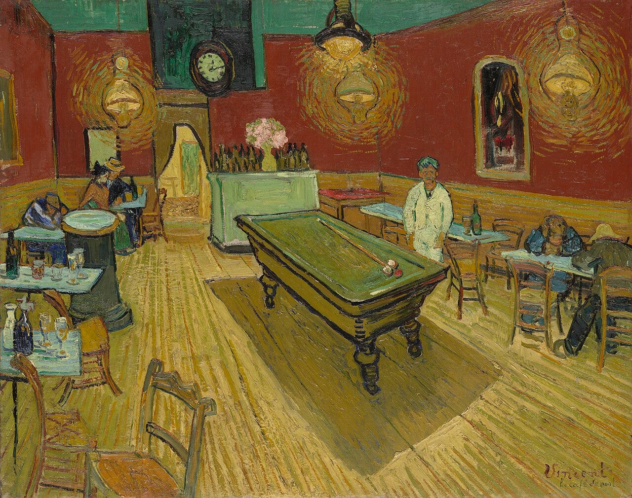
Van Gogh, The Night Café (1888)

Van Gogh painting of a café interior with red walls, a green ceiling and yellow lamps
Vincent van Gogh, The Night Café (1888), Yale University Art Gallery.

Van Gogh told his brother he had tried to express the terrible passions of humanity by means of red and green. He meant the sentence literally: blood red walls, a green ceiling, and nothing placed between them to soften the meeting.

He painted it over three nights, sleeping through the days, in the café where he was renting a room upstairs. It hangs at Yale now, one of his most reproduced canvases.

Gauguin, Vision after the Sermon (1888)

Gauguin painting of Breton women in white caps watching Jacob wrestle an angel on a red field
Paul Gauguin, Vision after the Sermon (1888), National Galleries of Scotland, Edinburgh.

The ground is a flat field of red, with Breton women in white caps on one side and Jacob wrestling an angel on the other. No field in Brittany has ever been that color, which is the point.

Gauguin split the picture with a tree trunk so the women and the vision share no ground and no color. He offered the painting to a village church nearby, and the priest turned it down.

Munch, The Scream (1893)

Munch painting of a figure holding its face on a bridge under an orange and red sky
Edvard Munch, The Scream (1893), Nasjonalmuseet, Oslo.

Munch left a written account of the evening behind it. The sun was going down, he was walking with two friends, and the clouds over the fjord turned blood red while he stood there, worn out.

The sky is built from yellows and reds that have not aged well. Cadmium yellow, one of his regular pigments, breaks down in damp conditions, and conservators studying his work have watched it go chalky. This version now lives under controlled light and humidity.


New here? Join 130,000 readers who get one great art story in their inbox, free.


Monet, Rouen Cathedral, West Façade, Sunlight (1894)

Monet painting of the Rouen Cathedral facade in pink, gold and blue light
Claude Monet, Rouen Cathedral, West Façade, Sunlight (1894), National Gallery of Art, Washington.

The stone is gray. Monet painted it pink, gold, blue and violet, because that is what the light was doing to it at the hour he was standing there.

He rented rooms across the square and kept more than thirty canvases going at once, swapping one for the next as the light moved. He finished them at Giverny and showed twenty of them in Paris in 1895.

Quick answers

  • What is color in art? Color is one of the elements of art, alongside line, shape, form, value, space and texture. It has three properties: hue, value and saturation.

  • What is the definition of tint in art? A tint is a hue with white added. Add black instead and you get a shade. Add gray and you get a tone.

  • What is the 3 color rule in art? A studio guideline: hold a picture to three colors, one dominant, one supporting, one used sparingly as an accent. It is advice, and plenty of good paintings ignore it.

  • What is the simplest definition of color? Color is what your eye reports when light of a given wavelength reaches it. A pigment has color because it absorbs part of the light and sends the rest back.

  • What are the four types of colors in art? Most courses group them as primary, secondary, tertiary and neutral.

Where to see these paintings

The National Gallery in London holds both the Van Eyck and the Titian, a few rooms apart. Giotto is in the Scrovegni Chapel in Padua, where entry is timed and you wait in a sealed chamber before going in. Michelangelo is on the Sistine ceiling in the Vatican.

The Girl is at the Mauritshuis in The Hague, Delacroix at the Louvre, Turner at Tate Britain, Gauguin at the National Galleries of Scotland in Edinburgh, Munch at the Nasjonalmuseet in Oslo, and The Night Café at Yale.

The Rouen canvases are scattered, with this one in Washington and several at the Musée d’Orsay. The Grande Jatte is the exception. The Art Institute of Chicago does not lend it, so Chicago is the only place it can be seen.

One last fact

Ultramarine stayed the most expensive pigment in Europe for four hundred years because the lapis came from one mountain range in Afghanistan. In 1824 the Société d’Encouragement pour l’Industrie Nationale offered 6,000 francs to anyone who could make it in a factory. Jean Baptiste Guimet collected the prize in 1828, and the color that had cost more than gold became something you could buy by the tube.