
Contrast in art is the deliberate pairing of opposites: light against dark, warm against cool, sharp against soft, full against empty. Painters use it to grab your eye and steer it. Here are twelve paintings built on that trick, and how each one works. Balance works on a related kind of trickery: a single small red dot placed right can outweigh a gray mountain that fills the rest of the canvas.
Contrast in 30 seconds
Value contrast: light against dark, the strongest kind. Caravaggio built a career on it.
Temperature contrast: warm colors against cool ones. One orange sun can own a blue harbor.
Edge contrast: sharp detail against soft blur, how painters fake depth and focus.
Contrast of fullness: a crowded zone against an empty one. The void does half the work.
Maximum contrast is black on white. One painter made exactly that, and it hangs in a museum.
Caravaggio, The Calling of Saint Matthew (1599-1600)
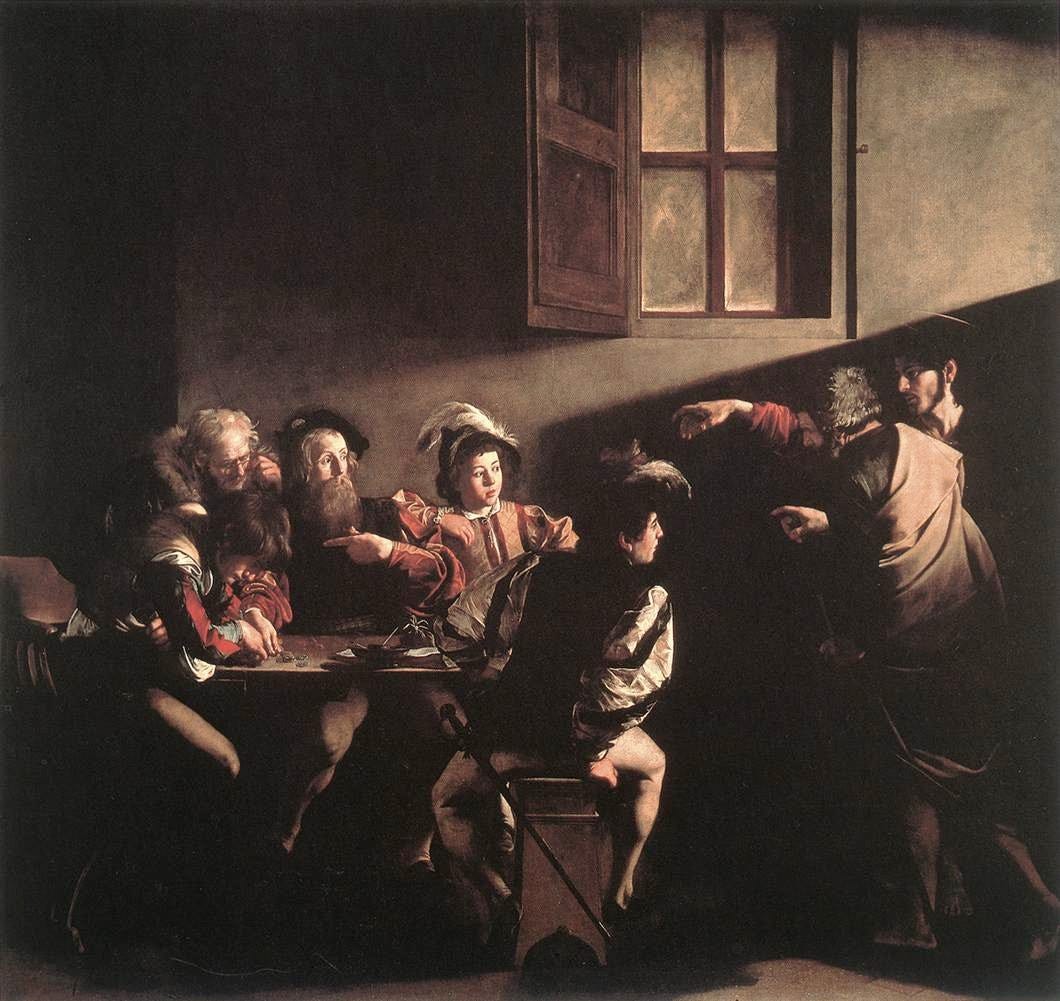
One diagonal blade of light crosses a dark tavern and lands on one stunned tax collector. The window in the picture is dark; the light comes from somewhere else entirely. This is chiaroscuro at full power, and nobody did it harder than Caravaggio.
In the Contarelli Chapel in Rome, you drop a coin in a box to switch on the lamp that lets you see it. A painting about light, waiting in the dark for spare change.
Georges de La Tour, The Magdalen with the Smoking Flame (c. 1640)
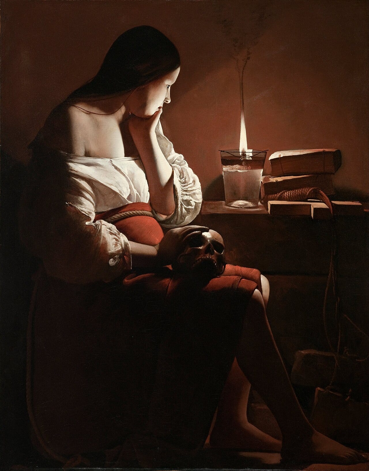
One oil lamp, one face, and blackness everywhere else. Pushing chiaroscuro until the darks swallow almost everything has a name, tenebrism, and La Tour was its quietest master.
He was famous in his lifetime, then completely forgotten for almost three centuries. Scholars only reassembled his name and his paintings starting in 1915.
Goya, The Third of May 1808 (1814)
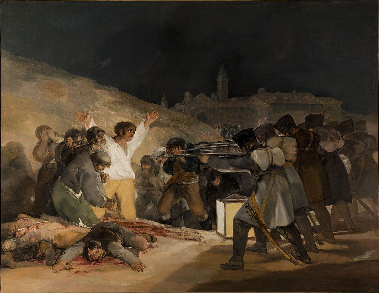
A man in a white shirt throws his arms open before a firing squad, lit by one square lantern against a hillside of darkness. The brightest thing in the picture is the man about to die. Goya made the contrast do the screaming.
He painted it six years after the executions happened, and put the lantern inside the scene so the killers bring their own light.
Learn art the fun way


Rembrandt, The Night Watch (1642)
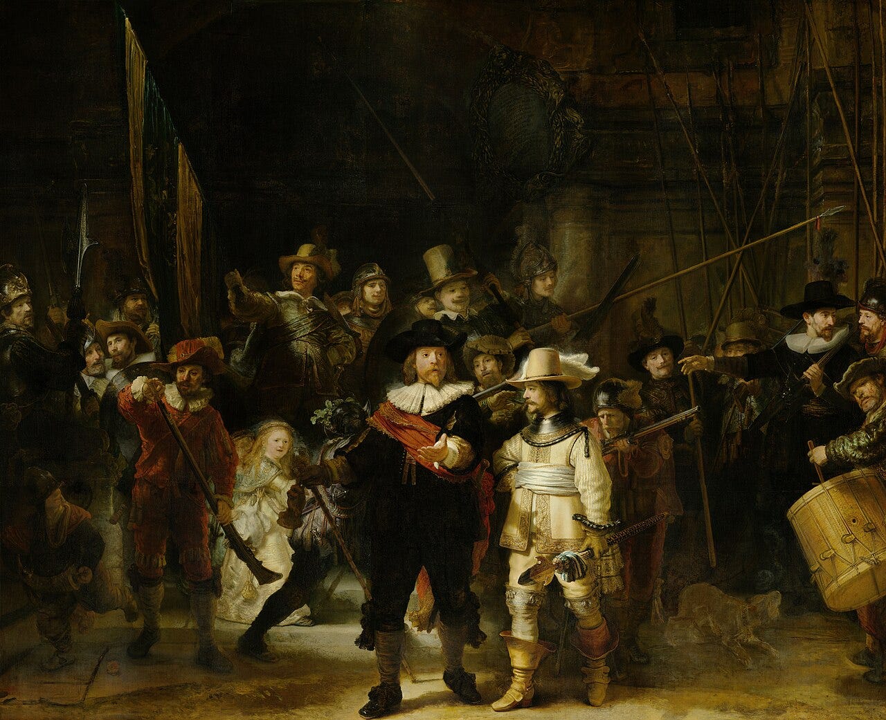
A whole militia company stands in shadow while the light picks out exactly two men and one small girl. Rembrandt used selective light the way a stage director uses a spotlight.
The famous name is wrong, by the way. It is a daytime scene; centuries of darkened varnish turned noon into night, and the nickname stuck.
Vermeer, The Milkmaid (c. 1658)
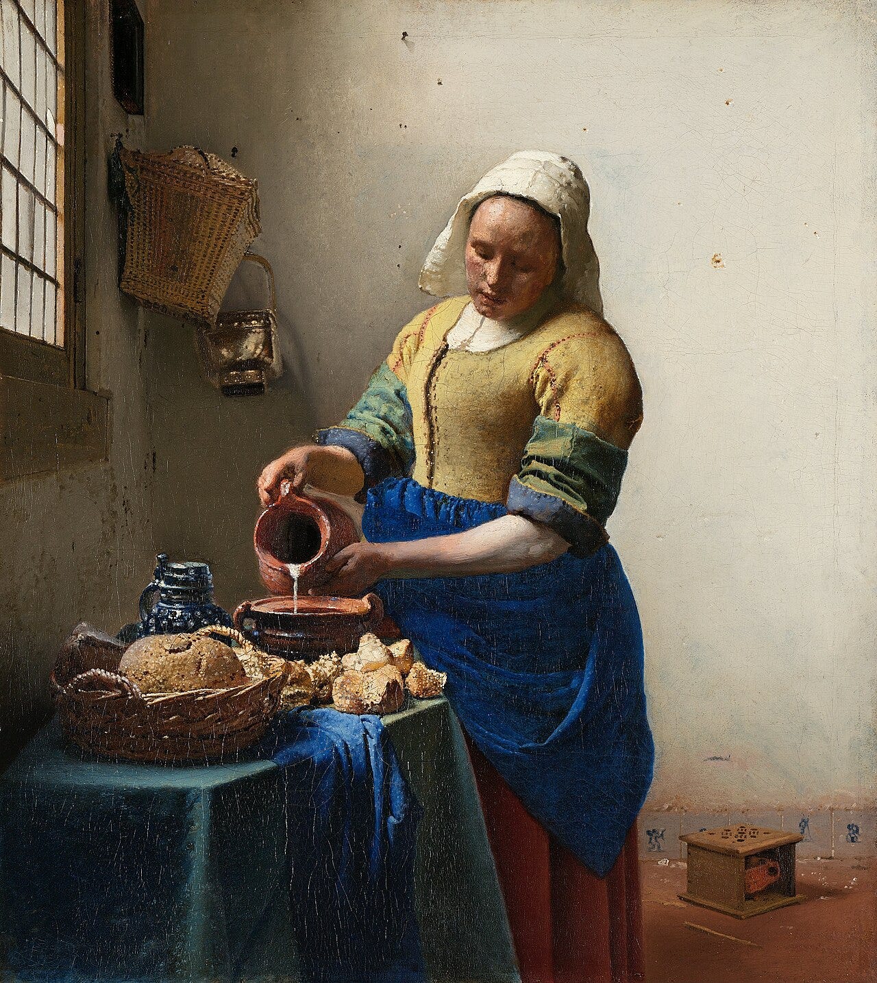
Cool blue apron against warm ochre bodice, cold wall against golden bread. Vermeer ran temperature contrast through a kitchen and made it monumental.
That blue is genuine ultramarine, ground lapis lazuli that cost more than gold leaf. He spent it on a servant pouring milk.
Turner, Snow Storm: Steam-Boat off a Harbour's Mouth (1842)
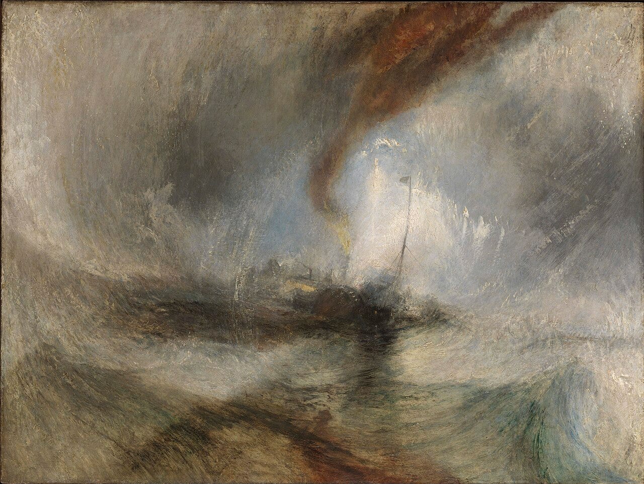
A pale vortex of light rips open the center of a black rotating storm. Turner put the brightness where the danger is, so your eye sails straight into it.
He claimed sailors tied him to the mast for four hours to observe the storm. Historians doubt every word, and the painting does not care.
Monet, Impression, Sunrise (1872)
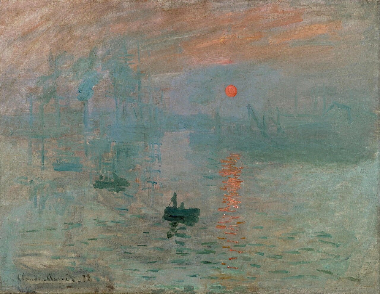
One small orange sun against an entire harbor of gray blue. Cover it with your thumb and the painting goes dead. Monet let a single warm note carry the whole picture.
A mocking critic borrowed the title to insult the group, and accidentally named Impressionism.
Hokusai, The Great Wave off Kanagawa (c. 1831)
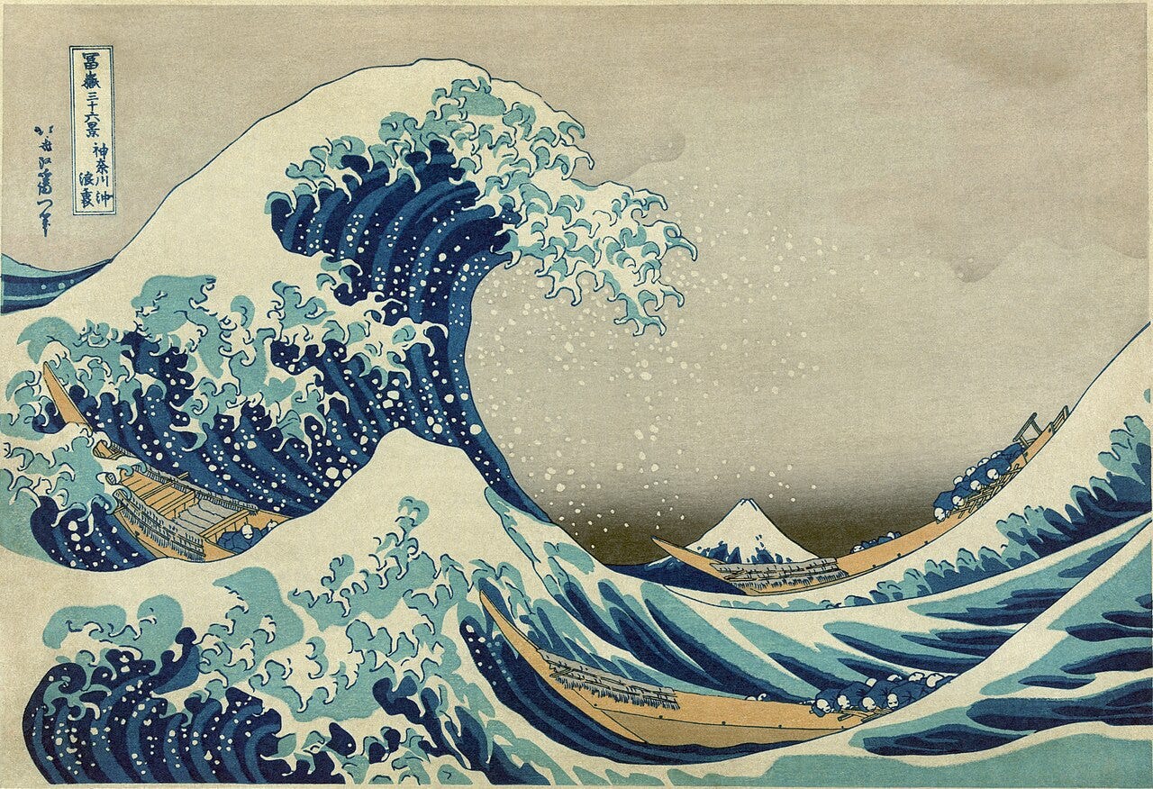
All the weight hangs on the left, a claw of deep blue foam, while the sky sits almost empty and Mount Fuji shrinks to a bump. Hokusai balanced fullness against void and let the void win.
That blue is Prussian blue, a chemical pigment newly imported into Japan, and audiences went wild for it.
Velázquez, Las Meninas (1656)
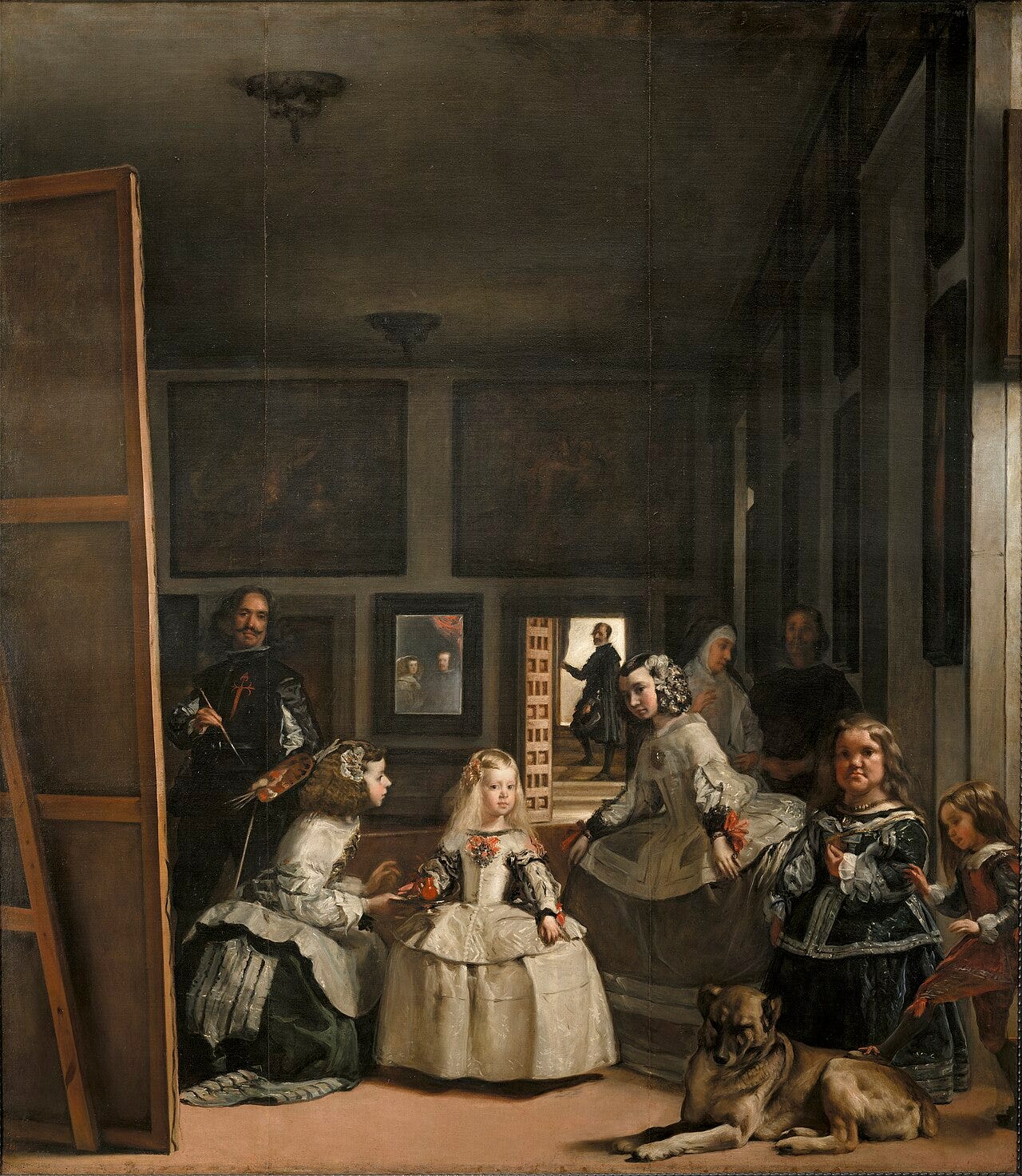
The princess and her maids are crisp; the back of the room melts into haze, except one small mirror holding two royal reflections. Velázquez used sharp against soft to tell you exactly where to look, then hid the king in the blur.
Mondrian, Composition with Large Red Plane, Yellow, Black, Gray, and Blue (1921)
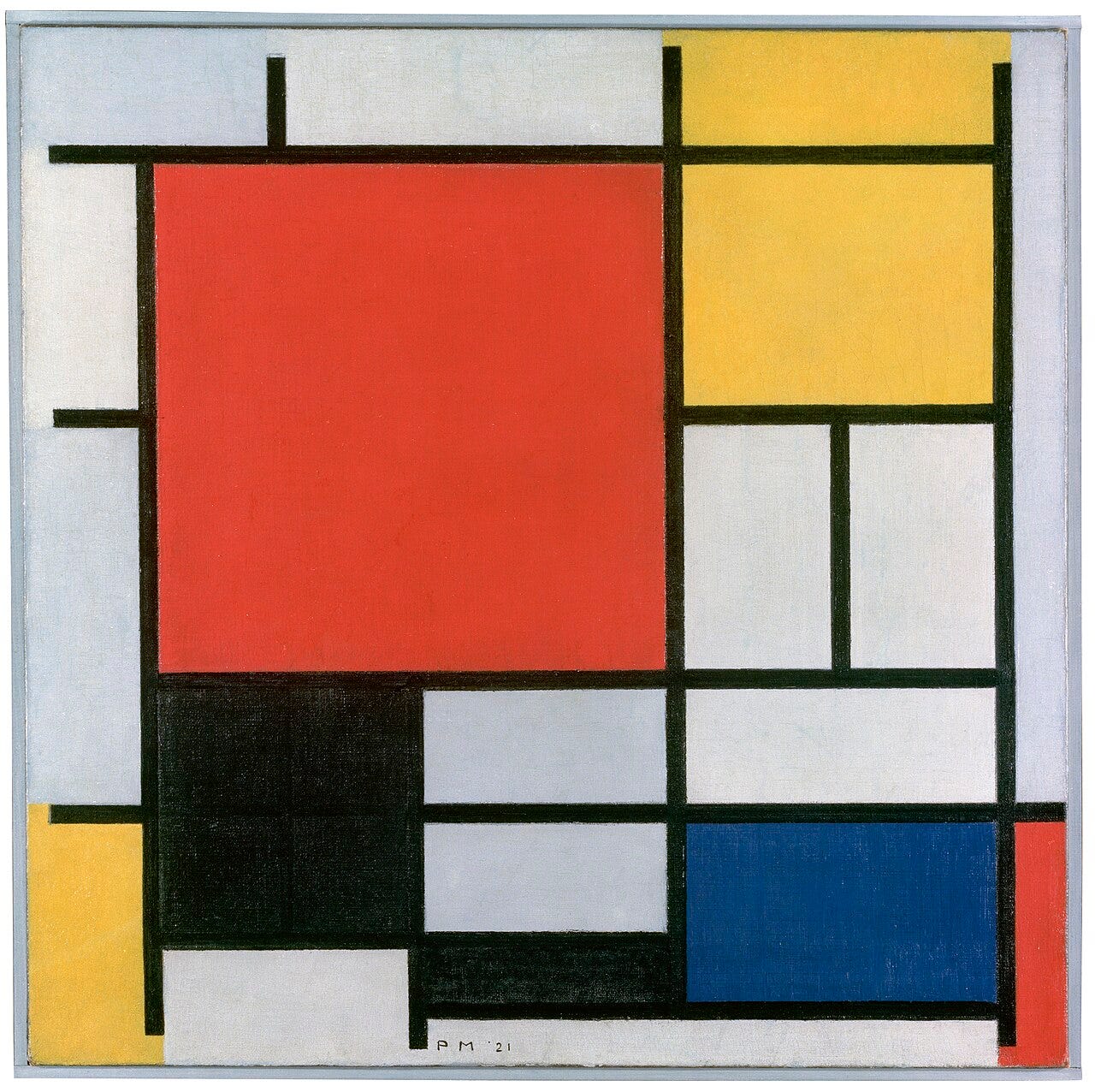
Pure primary colors slammed against white and caged in black lines. No shading, no transition, just plane against plane. Mondrian reduced contrast to its grid.
He avoided green all his life and reportedly asked to sit with his back to the window in restaurants, so he would not have to look at trees.
Malevich, Black Square (1915)
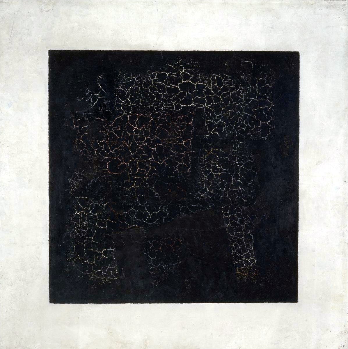
A black square on a white ground. That is the entire painting, and it is the loudest value contrast ever hung on a wall.
At its first exhibition Malevich hung it high across a corner of the room, the spot where Russian homes kept their icons. Nobody missed the message.
Aubrey Beardsley, The Peacock Skirt (1893)
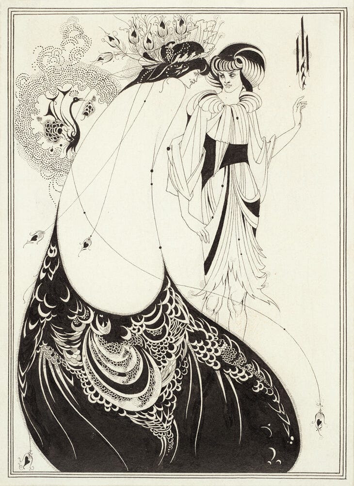
Ink drawings live or die by one contrast: solid black against untouched paper. Beardsley swung enormous empty whites against dense black patterning, and made emptiness feel luxurious.
He drew it for Oscar Wilde's Salome at age 21, and was dead of tuberculosis at 25.
You Might Also Like


Contrast is one of eleven principles that organize a composition. See how it connects to the rest in our complete guide to elements and principles of art. It connects closely to emphasis in art. It also relates to value in art. It also shares ground with proportion in art. It also echoes pattern in art. It also plays off harmony in art. Once you can name it, the full reading method sits in how to analyze a painting.
Quick answers
What are the types of contrast in art? The main ones are value (light versus dark), temperature (warm versus cool), edge (sharp versus soft), and fullness (crowded versus empty). Most great paintings run several at once.
Why do artists use contrast? To control your eye. High contrast is where you look first, so painters put it exactly where the story is.
What is the difference between contrast and value? Value is how light or dark something is. Contrast is the gap between values. A painting can be full of values and still low in contrast if they all sit close together.
Which painting is the best example of contrast? I would send a beginner to Caravaggio's The Calling of Saint Matthew: one beam of light, one dark room, and the whole method visible in a single glance.
Where to see these paintings
The Caravaggio hangs in the church of San Luigi dei Francesi in Rome, free to enter. Goya's Third of May and Las Meninas share the Prado in Madrid.
The Night Watch and The Milkmaid are both in the Rijksmuseum in Amsterdam. Impression, Sunrise lives at the Musée Marmottan Monet in Paris, and Black Square at the Tretyakov Gallery in Moscow.
One last fact
The word contrast entered painting talk through the French contraste, and academies once taught it as a rule of grouping figures. The painters on this list broke most of the academy's other rules, and kept this one.
My own ranking puts La Tour above Caravaggio here. Caravaggio stages a whole tavern around his beam of light, while La Tour needs one candle flame and one face in The Magdalen with the Smoking Flame to do the same job with far less machinery.
Malevich gets more credit for maximum contrast than the idea earns on its own. A black square on white reads as a diagram of the concept. Beardsley's Peacock Skirt runs the same black against white and asks more of the eye, holding an actual figure inside all that ink.