
Harmony in art is agreement: colors from the same family, shapes that rhyme, tones that sit close together. Where contrast wakes the eye, harmony settles it. Here are ten painters who tuned their pictures like chords, the two most recent in words only. Balance works a different logic, weighing unlike elements until they settle, explained on its own in balance as its own principle.
Harmony in 30 seconds
Harmony means related elements: neighboring colors, echoing shapes, close values. It is an ingredient of unity, which is the finished whole. Those close values are their own principle too, covered on its own in value in art.
Analogous colors, neighbors on the wheel like blue-green-teal, are the fastest route to color harmony.
Harmony without any contrast turns to wallpaper. Painters tune the ratio, not the absolute.
A harmony can be a signature: some painters play the same chord their whole career.
The musical words are not decoration. Painters borrowed harmony, tone, and key from music on purpose, and some titled their work that way.
Monet, the Water Lilies (c. 1920): one chord, wall-sized
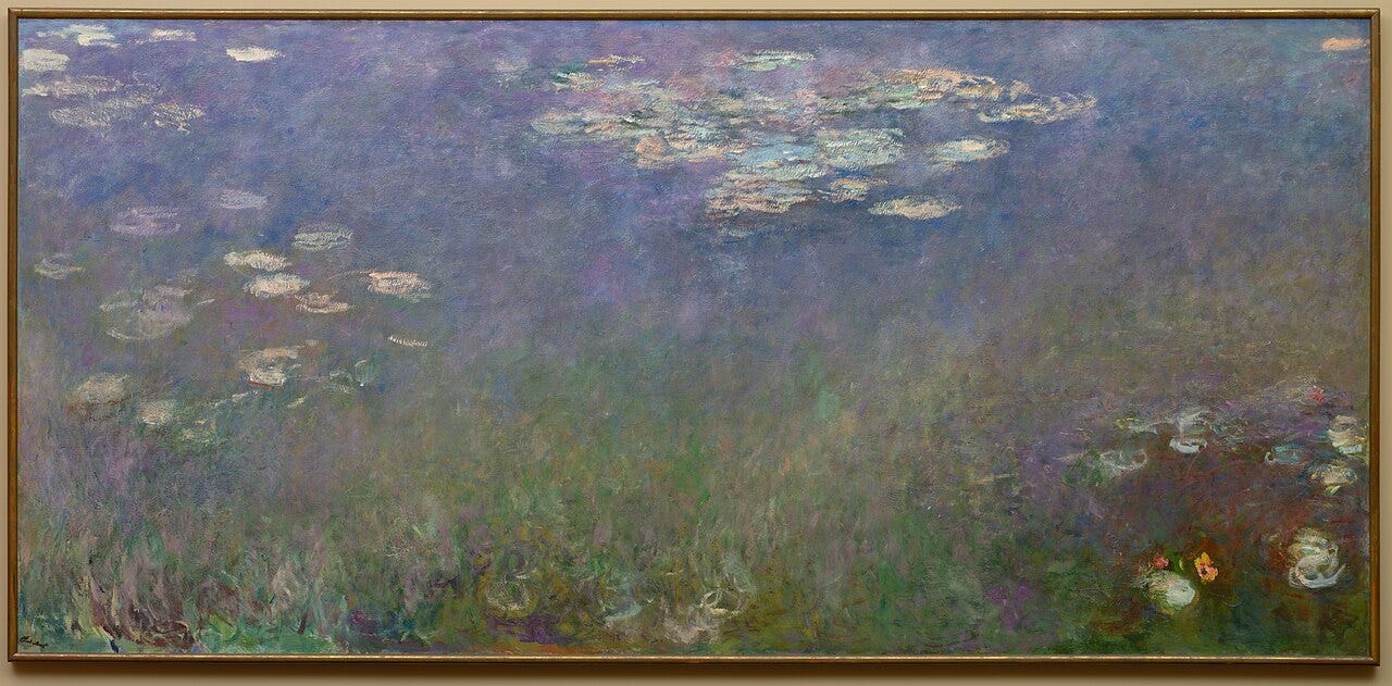
Blues into greens into violets, one continuous family of cool color with no outsider admitted. Monet tuned the pond to a single chord and let it ring around two entire oval rooms.
Late in life cataracts pulled his harmonies toward muddy reds. After surgery he saw his recent canvases clearly, was horrified, and destroyed or reworked several.
Whistler, the Nocturnes and Symphonies (1860s-1870s): harmony as a title
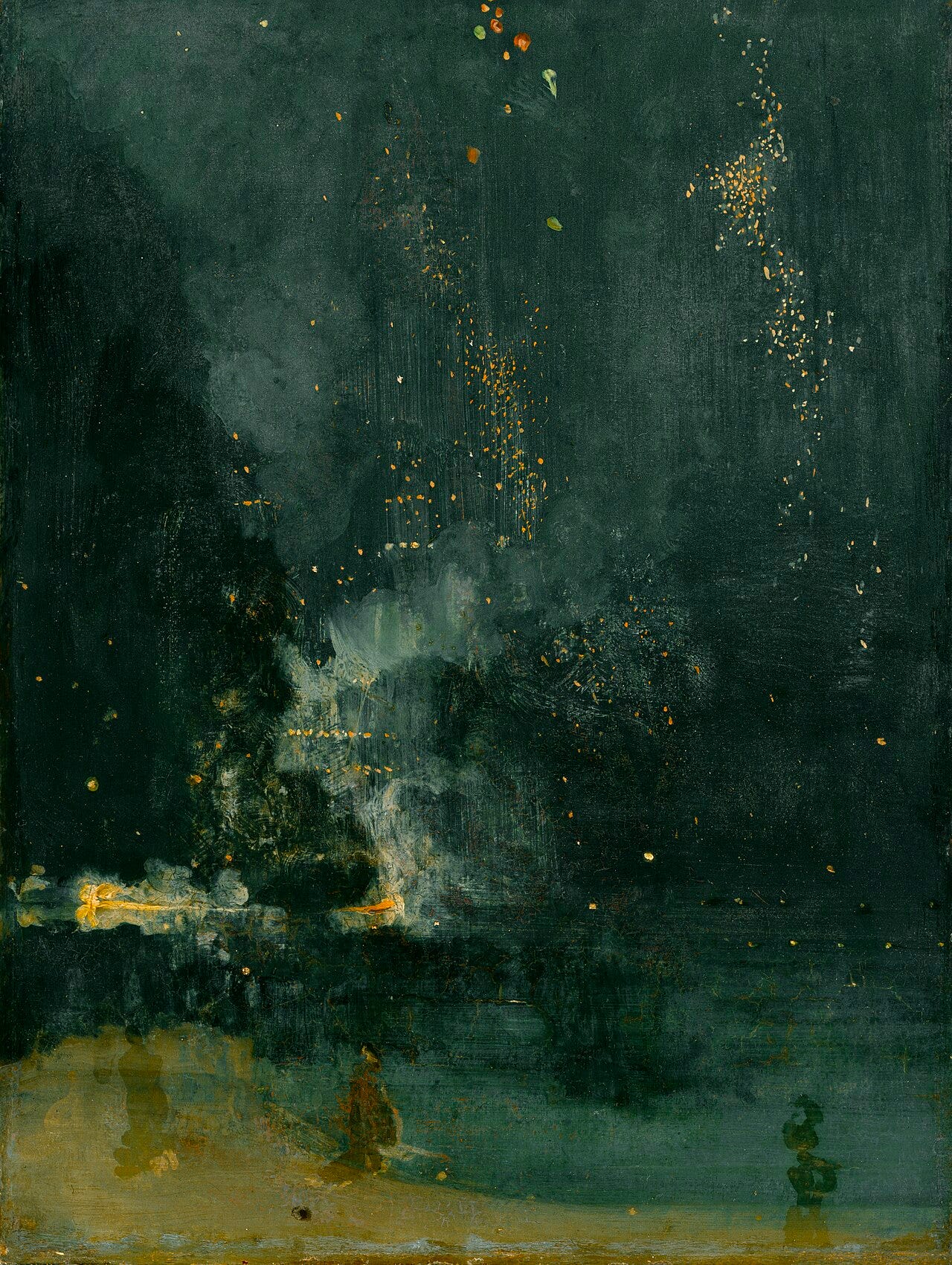
No painter said it plainer: Whistler literally titled his pictures Harmony in Grey and Green, Symphony in White, Nocturne in Blue and Silver. The subject was the chord; the girl or the river just held the notes.
Puvis de Chavannes, the murals (1870s-1890s): the pale agreement
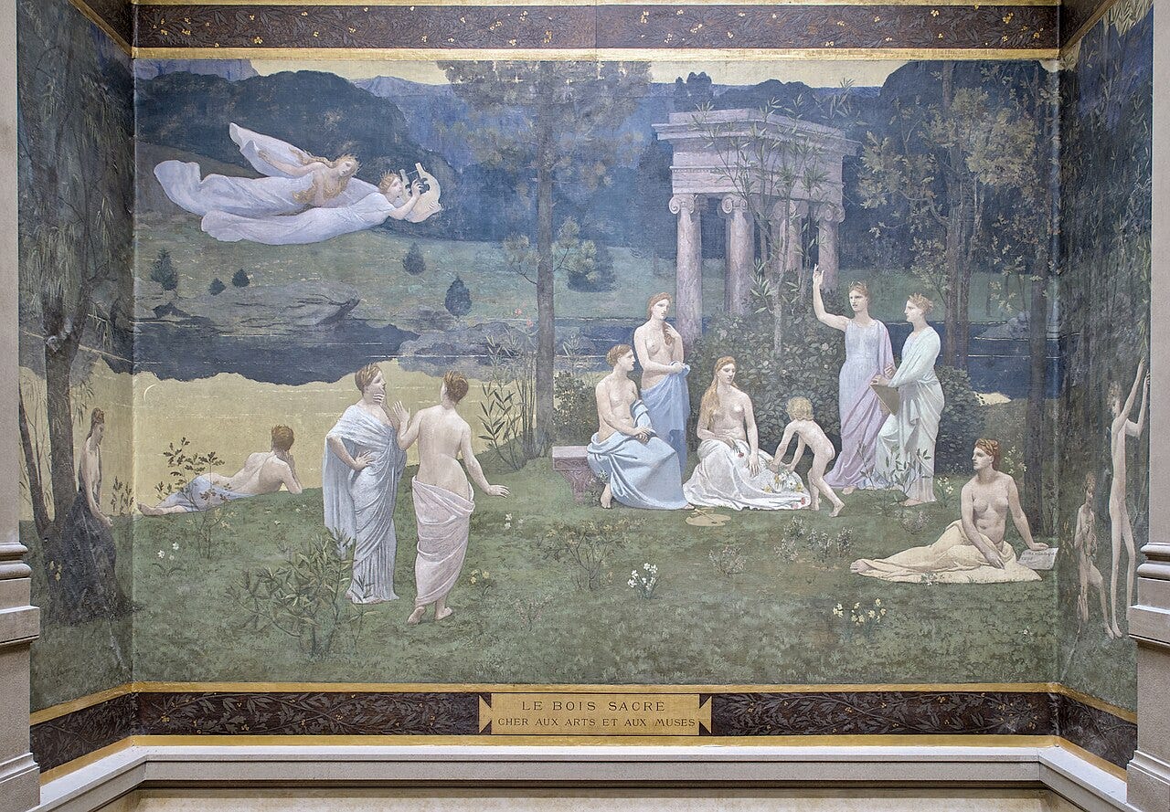
Chalky blues, dove grays, and faded greens, every tone lowered until the whole wall breathes at the same quiet pitch. Pierre Puvis de Chavannes made harmony a mural strategy: walls should calm a room, not shout at it.
He managed the rarest career trick of his century: the official academy loved him, and so did Seurat, Gauguin, and the young Picasso, who borrowed his pale harmonies for the Blue Period.
Learn art the fun way


Vermeer, The Milkmaid (c. 1658): the blue and yellow chord
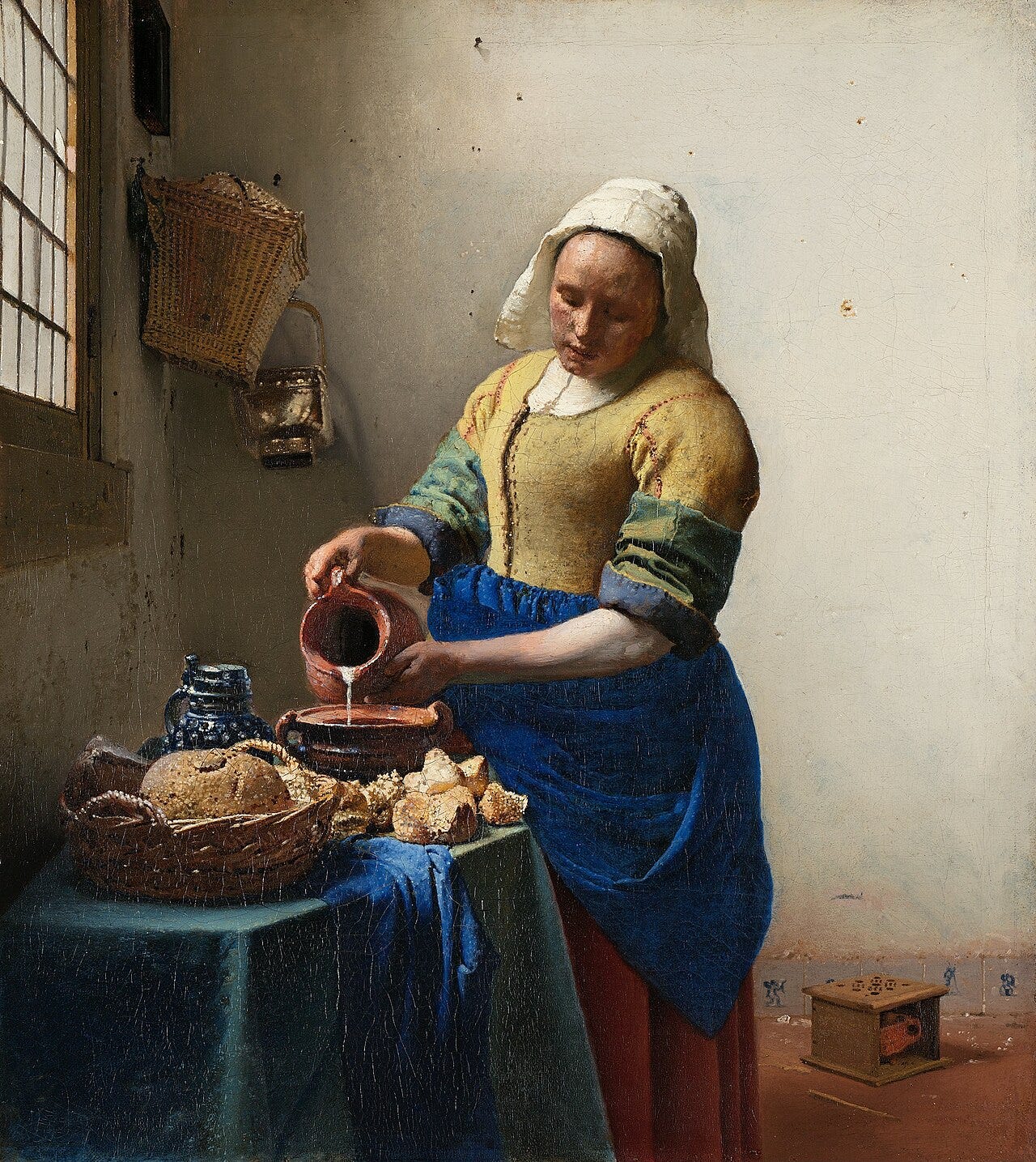
Blue apron against yellow bodice: Vermeer played the same two-note chord across his whole career, from milkmaids to pearl weighers, until it became his signature key.
Analyses show he worked ultramarine even into underlayers and shadows, so the blue would resonate through the harmony from below.
Corot, the silvery landscapes (1850s-1870s): the gray-green key
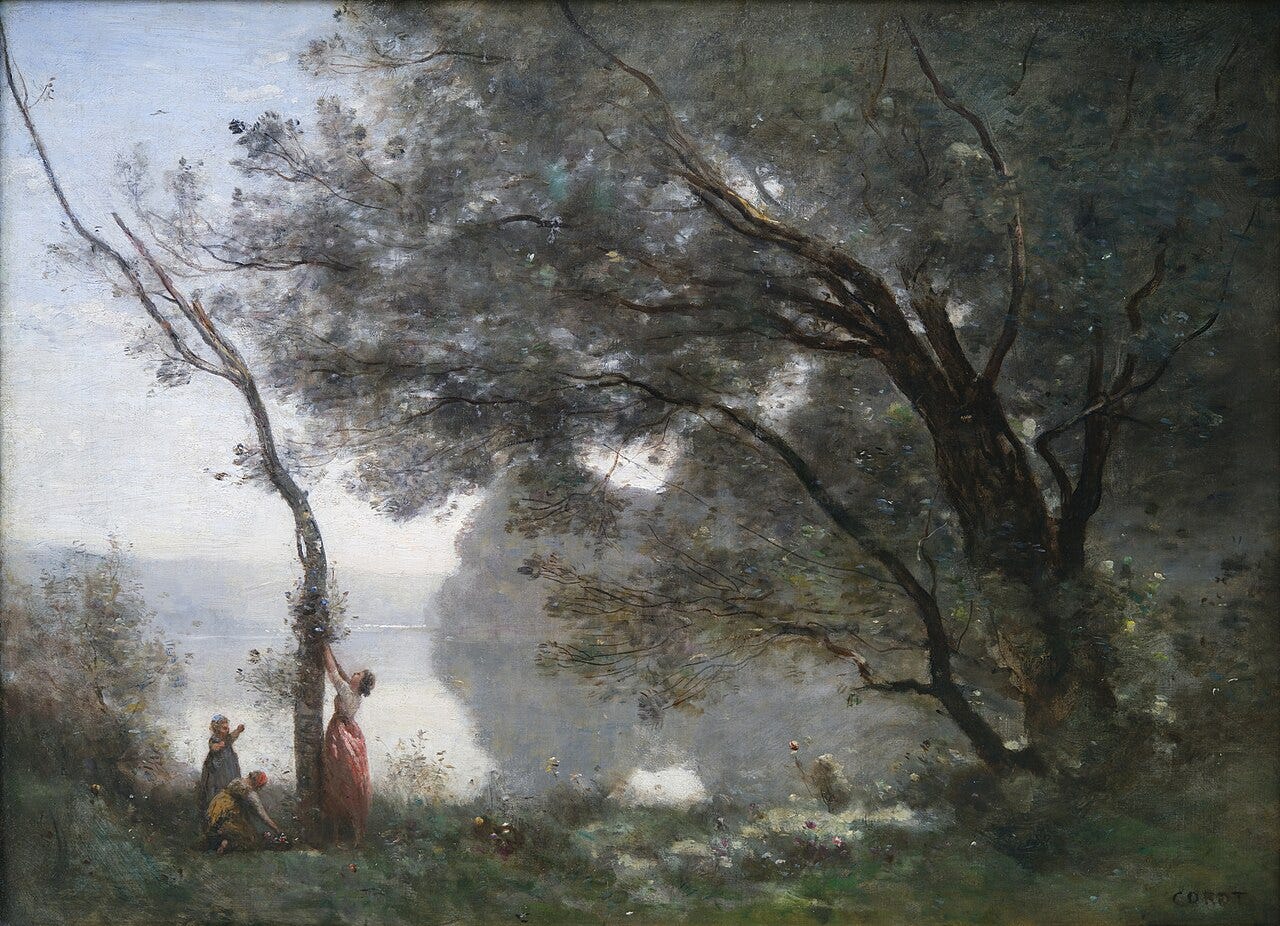
Willows, mist, and water, all pitched in silvered grays and soft greens, a harmony so recognizable it became a brand. Corot tuned nature down to one gentle register.
The brand was too easy to fake. The old joke among dealers: Corot painted three thousand canvases, of which ten thousand are in America.
Gauguin, the Tahitian canvases (1890s): the warm flat chord
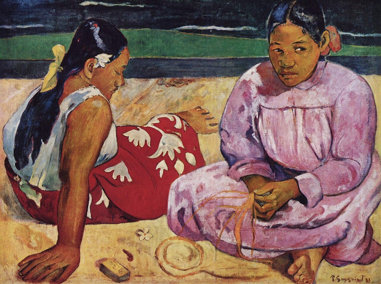
Orange sand, pink paths, red pareos: Gauguin laid warm colors side by side in flat zones, unmixed, agreeing like notes in a major key. Paris critics called the harmonies barbaric. He filed that under compliments.
Klimt, The Kiss (1907-1908): gold as the great agreer
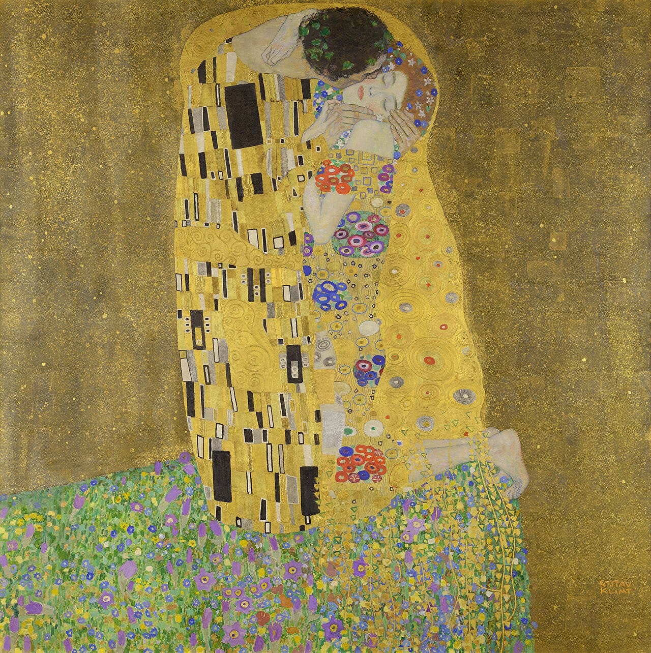
Whatever colors enter the picture, the gold absorbs them into one continuous metallic tone. Klimt used gold the way a choir uses a drone, a constant under every voice.
Cézanne, Still Life with a Curtain (c. 1895): the built harmony
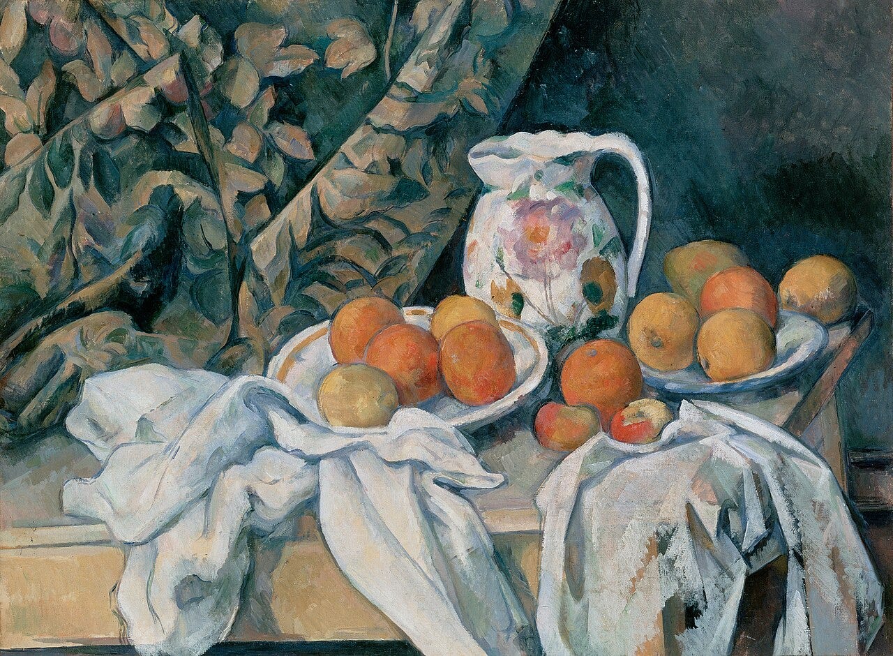
Greens modulate into ochres, ochres into reds, every step small and deliberate. Cézanne said that when color is at its richest, form is at its fullest: his harmonies are load-bearing.
The quiet moderns: Rothko and Morandi
Mark Rothko floated close-valued neighbors, orange on red, plum on maroon, until the boundary itself vibrated softly. Giorgio Morandi spent fifty years painting the same dusty bottles in hushed grays and beiges, harmony narrowed to a whisper. Rights are enforced in some countries for both, so words only.
Morandi never dusted the bottles. The gray film was part of the harmony.
You Might Also Like


Harmony is one of eleven principles that organize a composition. See how it connects to the rest in this guide to every element and principle of art. It also plays off contrast in art.
Quick answers
What is harmony in art? Agreement between elements: related colors, rhyming shapes, close values. It reads as calm, coherence, and intention.
What is the difference between harmony and unity? Harmony is elements getting along; unity is the whole picture reading as one thing. Harmony is a chord, unity is the finished song.
How do artists create color harmony? Mostly with analogous palettes (neighbors on the color wheel), a limited number of hues, repeated accents, and a shared undertone mixed into everything.
What is an example of harmony in a painting? Monet’s Water Lilies: an entire room of blues, greens, and violets from one family, with nothing foreign allowed in.
Where to see these works
The Water Lilies fill the Orangerie in Paris, and Whistler’s Symphonies and Nocturnes are spread between the Tate, the Freer in Washington, and beyond. Puvis de Chavannes covers whole stairwells in the Panthéon in Paris and the Boston Public Library.
The Milkmaid is at the Rijksmuseum, Corot at the Louvre and everywhere his imitators are not, Gauguin from Orsay to Boston, The Kiss at the Belvedere, and Cézanne from the Hermitage to Philadelphia.
One last fact
When Whistler showed Symphony in White, No. 1 in 1863, it hung at the Salon des Refusés a few steps from Manet’s Déjeuner sur l’herbe. The two most scandalous paintings in Paris that spring were a picnic, and a chord.