What Does Matisse's Harmony in Red Mean?

Matisse painted this room in blue, then repainted it almost entirely red. Here is what Harmony in Red is really doing to the space around its table.

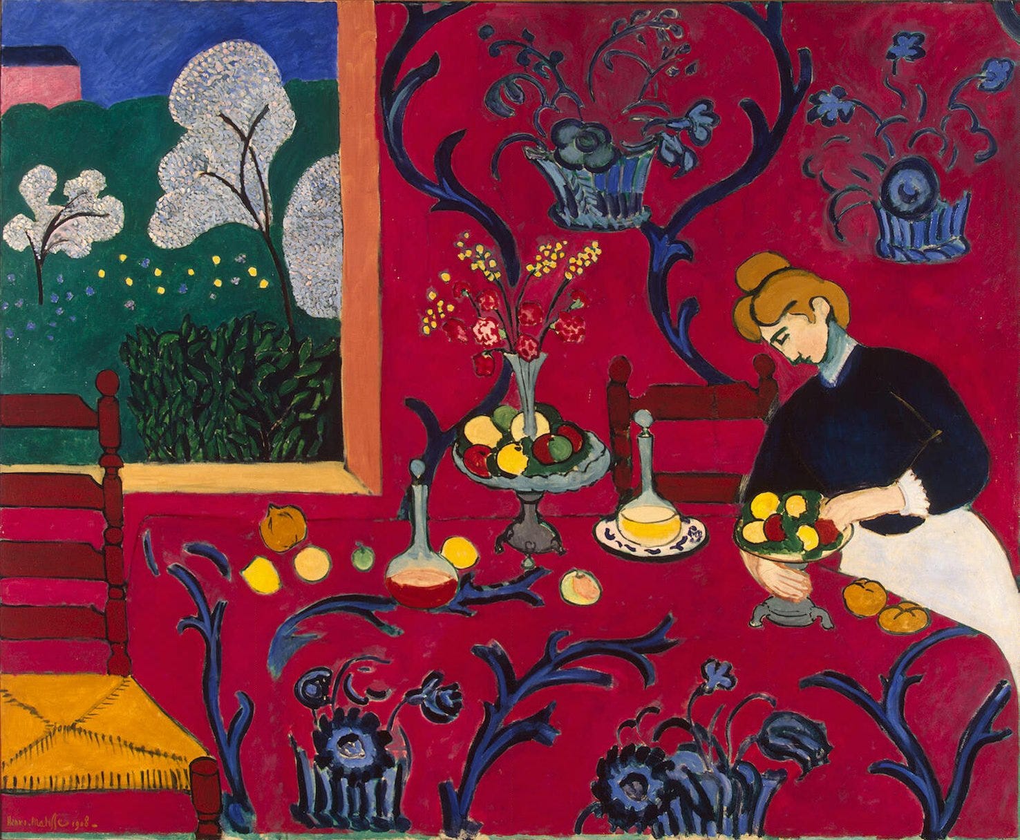
Henri Matisse's Harmony in Red turns a dining room into a single flat field of pattern, the tablecloth and wallpaper sharing one design. The room was not born red. Matisse painted it blue first, sold it that way, then repainted it red in 1909, after his patron already owned the picture.

Red dining room with patterned walls
Henri Matisse, Harmony in Red, 1908.

The woman at the table is barely the point.

The real subject is how far Matisse could push flat pattern before the room stopped looking like a room.

  • Date: Painted and exhibited in 1908, repainted red in 1909.

  • Medium: Oil on canvas, about 180 by 220 centimeters.

  • Location: Hermitage Museum, Saint Petersburg.


Learn art the fun way. Join 170,000 readers getting one painting and its story every week.


More Matisse and the Fauves

If the flattened pattern in this painting caught your eye, these stories go further into painters who broke their own rules.


A Room Painted Three Times

Harmony in Red went through at least three color stages before Matisse considered it finished. Historians have traced an early green underlayer, a blue version shown at the Salon d'Automne in 1908, and the final red repaint applied in 1909, months after the Russian collector Sergei Shchukin had already bought the blue painting.

Matisse exhibited the picture at the Salon d'Automne in 1908 under the title Harmony in Blue. Shchukin bought it directly from that show.

In 1909, Matisse reworked the canvas again. He covered nearly the whole blue surface in red and renamed it The Dessert, Harmony in Red.

Most retellings compress this into one clean swap, blue turning to red. I think the three stage version explains the painting better than the tidy story most pages repeat, because it shows Matisse still deciding on color after the sale, not before it.

Open window overlooking a harbor
Henri Matisse, Open Window Collioure, 1905.

A Decorative Panel for a Moscow Dining Room

Shchukin commissioned Harmony in Red as one decorative panel among several for the dining room of his Moscow mansion. The finished canvas measures about 180 by 220 centimeters, oil on canvas, built to read as flat pattern rather than a framed view. Shchukin later commissioned Matisse's The Dance and Music for the same house.

Matisse wanted the room to work like a mental soother, closer to a comfortable armchair than a demanding picture.

Shchukin wrote back after seeing the finished red version. He said he liked the red room enormously, keeping it despite the late change.

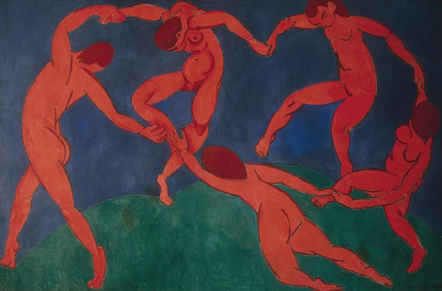
The Dance, shown here, came from the same run of decorative commissions for Shchukin. Both paintings trade detail for a handful of flat colors pushed as far as they can go.

Five red figures dancing in a circle
Henri Matisse, The Dance, 1910.

See art differently. 170,000 people read these free stories. Come find out why.


The Pattern That Erases the Table

The same swirling floral pattern covers both the tablecloth and the wall behind it in Harmony in Red, so the table barely reads as a separate surface. Only a chair back and one faint line hint that the room still has depth. The effect is deliberate, the opposite of a snapshot of a real dining room.

A window on the right keeps a patch of ordinary depth, a small garden view that briefly breaks the flat red field.

Everywhere else, the wallpaper, the tablecloth, and the fruit on the table sit on the same plane, with almost no shadow separating them.

To me, that flatness is the real subject of the room. Matisse was not trying to make the pattern behave, he was letting it win.

Nude figures resting in a colorful landscape
Henri Matisse, The Joy of Life, 1906.

A Second Try at an Old Subject

Harmony in Red reworks a subject Matisse had already painted in 1897, an earlier canvas also called The Dessert, done in a darker, more traditional style close to Impressionism. Comparing the two shows how far Matisse moved in about a decade, from muted realism to flat decorative color. The 1908 picture was nationalized by the Soviet state in 1918 and entered the Hermitage collection in Saint Petersburg, where it remains.

The 1897 version keeps a conventional sense of light and shadow across a similar table setting, with the same instinct for a servant figure near the food.

After 1918, Shchukin's collection was nationalized and later split between Russian museums, with Harmony in Red staying at the Hermitage rather than moving to Moscow.

Shchukin himself left Russia after the revolution and never saw the painting again, even though he had once owned it twice over, first in blue and then in red.

The Woman Nobody Named

The woman arranging fruit at the table in Harmony in Red is usually identified only as domestic help or a hired model, never as a named sitter. Her curved pose has been compared by at least one Matisse scholar to the reclining figures in his 1907 painting Bathers with a Turtle. She anchors the composition without being its real subject.

Her static gesture gives the eye a place to rest inside all that pattern.

The decorative surface around her, not her identity, carries the meaning of the painting.

Even the fruit on the table gets more individual attention than her face does, which tells you where Matisse wanted the eye to land.

I read that imbalance as the whole point of the painting. She is furniture in a room built for color, not for portraiture.

More Matisse, More Color Experiments

Three more stories about painters who turned color and pattern into the actual subject of the picture.


No boring lectures, ever. Join 170,000 readers learning art the fun way, free.


Why the Blue Version Still Matters

The blue version of Harmony in Red survives only in period photographs, since Matisse painted over it. That hidden layer matters because it proves the red we see today was a late, deliberate decision, not the room's original color. Matisse described his own goal as a balance of forces, treating color as structure rather than description.

Seen this way, the picture reads less like a record of a dining room and more like a demonstration of how far color alone can carry a composition.

I keep coming back to the fact that Matisse chose red only after he had already been paid for blue. That timing says more about his priorities than the finished canvas does on its own.

The canvas Shchukin once said he liked enormously still hangs at the Hermitage, dated 1908 even though the red was added a year later.

Older man in glasses and a coat
Henri Matisse, photographed in 1933.

Frequently Asked Questions

  • Why is Harmony in Red also called The Red Room?

    Both names describe the same 1908 canvas. Matisse's dominant red pattern across the walls and table gave it that popular nickname in English.

  • Is it true the painting was originally a different color?

    Yes. Matisse painted the room green, then blue, before repainting nearly the whole canvas red in 1909, after Sergei Shchukin already owned the blue version.

  • Who commissioned Harmony in Red?

    The Russian textile merchant and collector Sergei Shchukin, as one decorative panel among several for the dining room of his Moscow mansion.

  • Where is Harmony in Red today?

    At the Hermitage Museum in Saint Petersburg, part of the Shchukin collection nationalized after the 1917 revolution.

  • Who is the woman in the painting?

    She is generally identified as a servant or hired model, not a specific named sitter.

  • What size is Harmony in Red?

    About 180 by 220 centimeters, oil on canvas, close to two meters wide.


Ten minutes, one masterpiece. That is the deal. 170,000 readers already took it, free.