
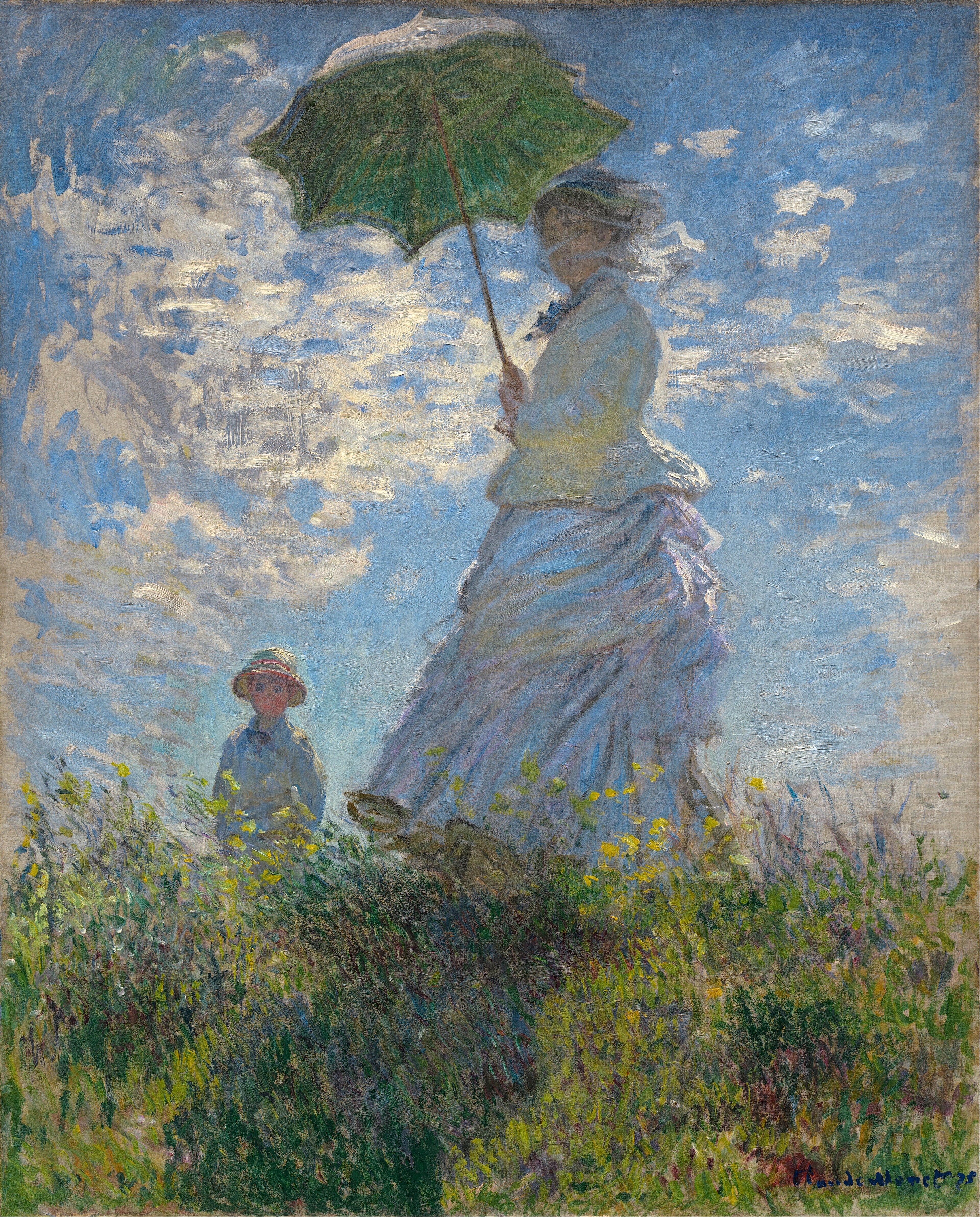
Impressionist paintings look blurry up close because the painters built them from short, broken strokes and left every touch visible. The strokes barely outline any form. Step back, and the eye pulls them together into a scene full of light.
Viewers in the nineteenth century expected the opposite. The paintings they admired had a smooth, polished surface with no trace of the brush, and a canvas that showed its strokes looked unfinished to them.
Cool Stories About Art is a newsletter to learn art the fun way.
Join 200,000+ readers and get:
10 new art stories / month
The entire archive of content (1,000+ articles)
Comment, ask questions, and chat with other readers
Most explanations stop there and add a tidy piece of science: the painters set pure red beside pure yellow and let the viewer's eye mix the orange. I think that story is only half true.
The painter who built pictures on purpose from separate touches of pure color, to be blended in the eye, was not Monet. It was a younger man named Georges Seurat, and he showed the method in 1886 at the last Impressionist exhibition, where a critic gave it a new name, Neo-Impressionism.
So if the blur is not optical mixing, what is it? The answer turns out to be a fight over what a finished painting is supposed to look like.
What You'll Discover
Who really mixed color in the eye.
What a smooth painting looked like.
What a critic wrote in 1874.
Why one painted sun seems to pulse.
Whether Monet's eyes were to blame.